
From Data to Decision in Minutes. How Claude Charts Change the Game for Marketing & Sales
A practical guide with 10 use cases and prompts for interactive charts and data visualizations.

This is Part 2 of the Claude for Marketing & Sales mini series. Each part is a practical guide to a different Claude capability for marketers.
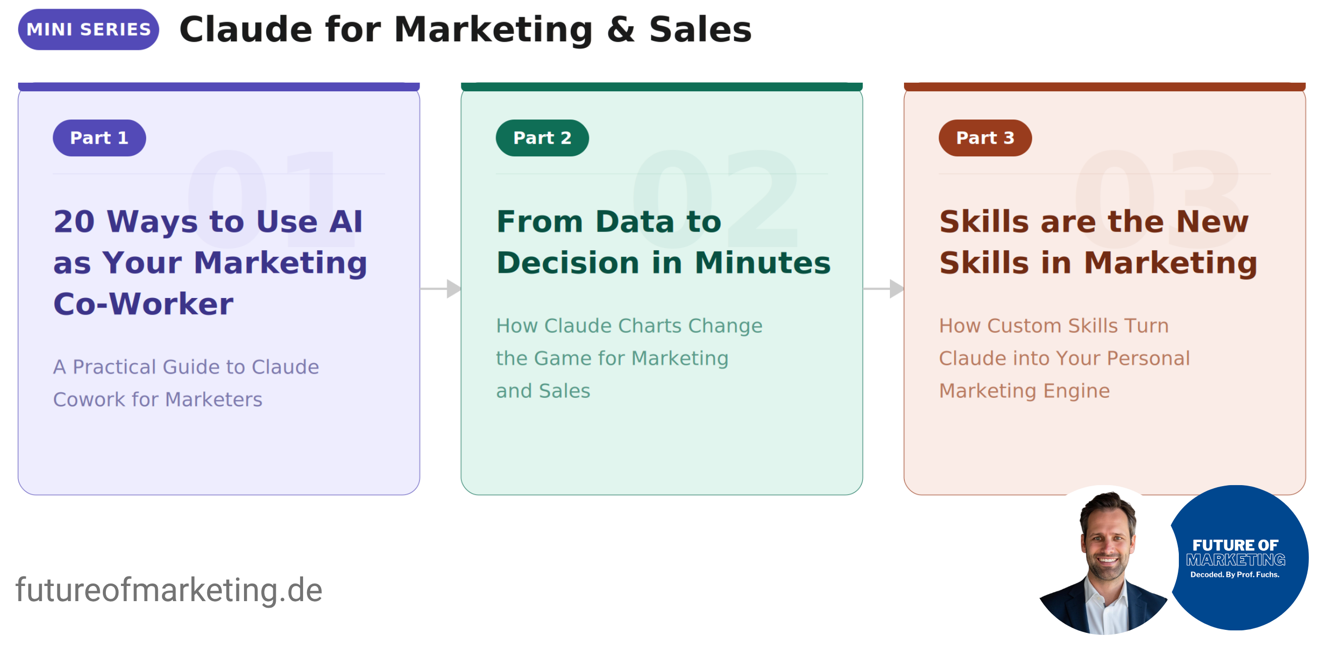
Part 1: 20 Ways to Use AI as Your Marketing Co-Worker: How to set up Claude Cowork, how to work with it, and 20 use cases to start today.
Part 2 (this guide): From Data to Decision in Minutes: How Claude Charts turns marketing data into interactive visualizations and dashboards.
Part 3: Skills are the New Skills in Marketing: How to create custom Skills that make Claude permanently better at your specific marketing work … with 10 ready-to-use Skill templates.
Two weeks ago, I showed you how to use Claude Cowork as your marketing co-worker. That guide was about documents, briefs, and workflows. It became the most-read article on this channel.
This one picks up where it left off.
Be honest. How many hours did your team spend last month turning data into slides?
Not analyzing data. Not making decisions. Just formatting. Copying numbers into Excel. Screenshotting dashboards. Rebuilding the same bar graph for the third stakeholder who wanted a “slightly different view.”
Nobody planned for this to become a core marketing activity. But here we are. The gap between having an insight and showing it to someone who needs to act on it has quietly become one of the biggest time sinks in modern marketing.
Now imagine the opposite. You have an idea for a chart. You describe it. And it exists. Interactive, clean, ready to share. In minutes. You spend your time on what the data means, not on how to display it. Your leadership team sees exactly what you see. Your decisions get faster because the visual is no longer the bottleneck.
That is what Claude Charts does.
How It Works
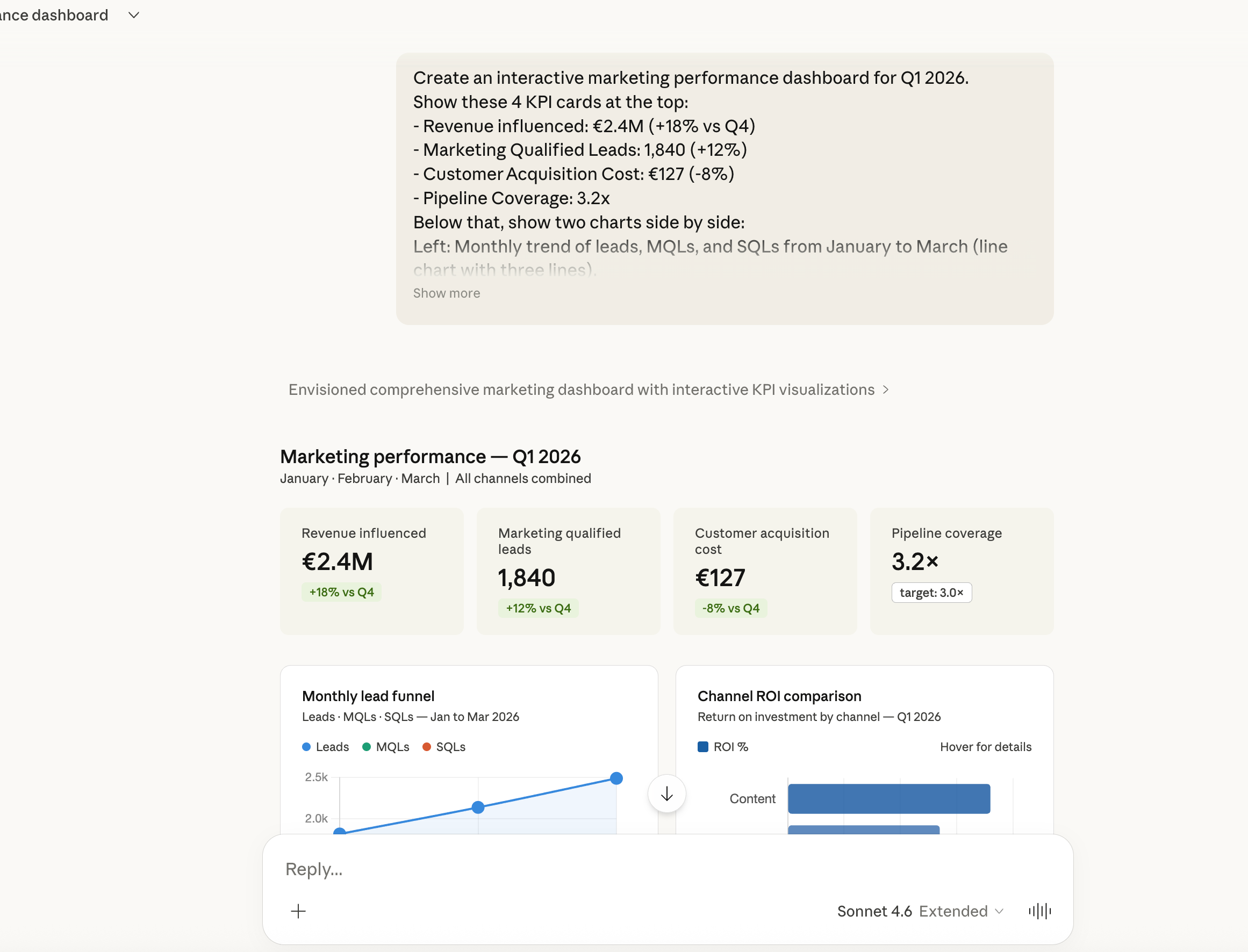
Open claude.ai. Type a prompt that starts with something like “Create an interactive chart about …” and describe what you need.
That is it.
Claude generates the visualization directly in the chat. You can hover over data points, explore segments, and interact with the chart in real time.
One important detail: if Claude tries to write code instead of generating a chart, add “Don’t code. Interactive chart only.” to your prompt. Works every time.
Claude Charts Goes Far Beyond Dashboards
When most people hear “interactive charts,” they think bar graphs and pie charts. That is only the beginning.
Claude builds full interactive visualizations. Conceptual models. Frameworks with clickable scenarios. Teaching tools you can use in a workshop or a lecture.
Here is an example: I needed an interactive teaching module for my university lecture on marketing communication. The topic: how does a brand message change when it passes through a media multiplier? One-step vs. two-step communication.
One prompt. Claude built an interactive HTML application with four real-world scenarios (TV advertising, influencer marketing, PR, retail), animated message flows, a message fidelity meter that shows control loss at each stage, and discussion questions. Ready to use in the browser, in front of 200 students.
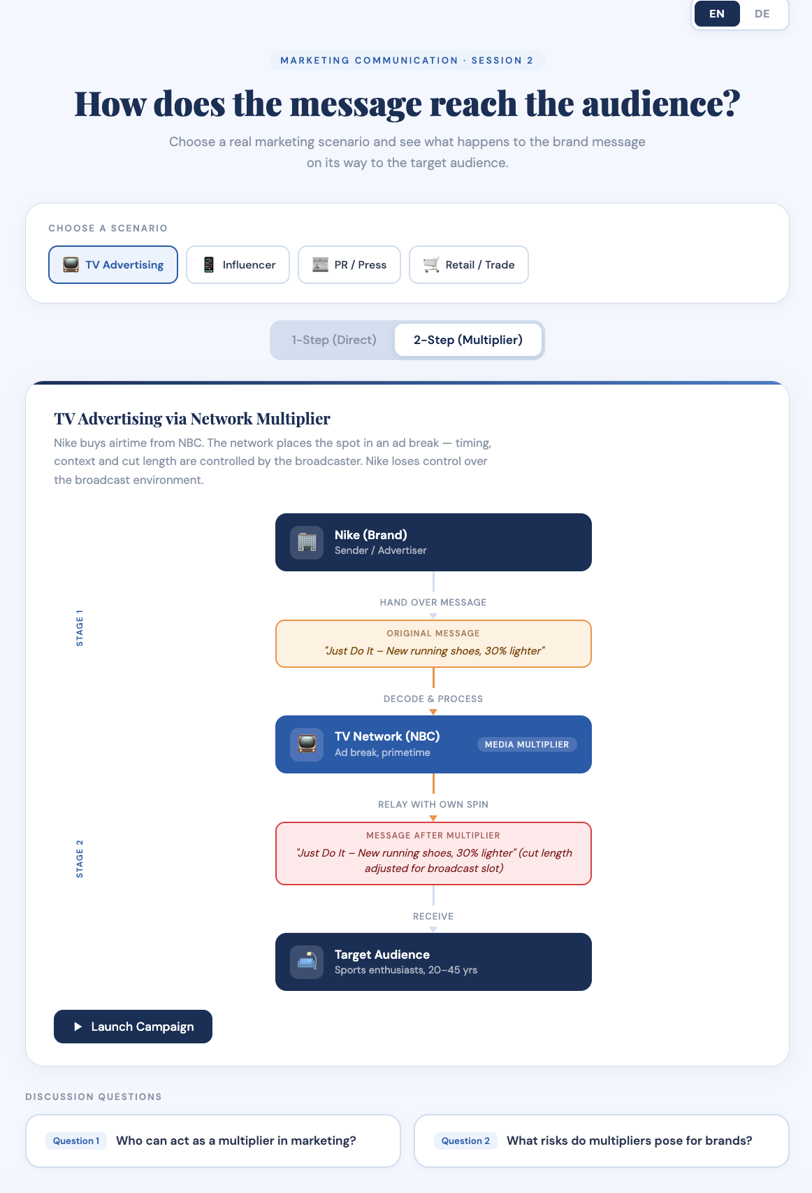
This is not a chart. This is an interactive application. Built in a single conversation.
Here is another example: I wanted a visual overview of every essay I have published on Future of Marketing. Not a spreadsheet. Not a Notion table. An interactive timeline.
Claude built a full HTML application: 16 essays mapped chronologically from October 2025 to March 2026, grouped by month, with a vertical timeline. Four statistics tiles at the top (total essays, active months, publishing frequency, peak month). Six filterable theme tags (AI & Agents, Strategy, MarTech & Data, Org Design, Content & Growth, Newsletter Meta). Click a tag, everything else dims. Click again, everything returns. Every entry links directly to the original essay. Works in light and dark mode.
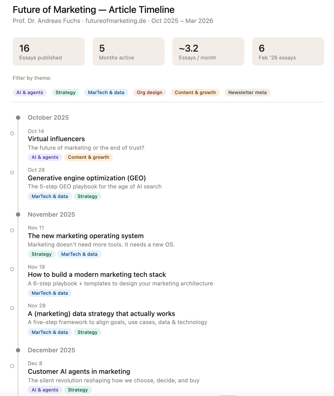
One prompt. A content library you can actually navigate.
💡 Pro tip: You do not need to type in your articles manually. Use the Claude in Chrome extension, give it your website URL, and Claude scrapes the page and extracts every article automatically. In my case: futureofmarketing.de. That is it. Alternatively, connect a Notion database, an Excel file, or any other source where you already track your content. Claude reads the database and builds the timeline from there. Either way: one input, zero manual data entry.
For marketers, the implications are immediate. Client presentations where stakeholders can click through scenarios. Workshop materials where participants explore frameworks themselves. Training modules for new team members. Content archives your audience can browse. Strategy visualizations that do not just show data, but show how things work.
👉 Think beyond dashboards. Every framework, every model, every process you explain in meetings can become an interactive artifact.
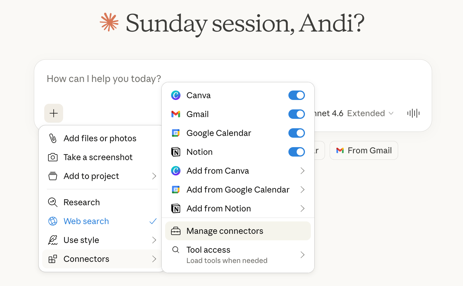
The Real Power: Connect Your Actual Data
The examples below use manually entered numbers. That is fine for a quick visualization. But the real leverage starts when you connect Claude to the tools where your data already lives.
Through Connectors and Plugins, Claude can pull data directly from your marketing stack. No exporting. No copy-pasting. No reformatting CSVs at 11pm before a Monday meeting.
Here is what you can connect today:
Productivity & Knowledge Management: Google Drive, Google Sheets, Notion, Microsoft Excel, Confluence. Upload a spreadsheet or connect a Notion database, and Claude charts your data directly.
CRM & Sales: HubSpot, Salesforce. Pull pipeline data, deal stages, conversion rates, or customer segments straight into a chart. No more waiting for your RevOps team to build a report.
Marketing Automation & Analytics: Google Analytics, Mailchimp, ActiveCampaign, Klaviyo. Campaign performance, email metrics, audience data, all chartable without leaving Claude.
Advertising & Social: Meta Ads Manager, Google Ads, LinkedIn Campaign Manager. Spend vs. return, audience breakdowns, campaign comparisons, visualized in seconds.
Project Management: Asana, Monday.com, Jira. Track campaign timelines, team workloads, or sprint progress as visual dashboards.
Communication & Collaboration: Slack, Gmail. Summarize and visualize patterns from conversations, feedback threads, or customer inquiries.
The workflow looks like this: Connect the tool. Ask Claude to pull the relevant data. Then ask for the chart. Three steps. One conversation. Real data.
👉 This means every chart in the list below can be built with your actual numbers, not hypothetical ones. That is the difference between a demo and a decision tool.
Three Rules for Better Marketing Charts
Before you dive into the use cases below, three principles that make the difference between a mediocre chart and one that changes a meeting:
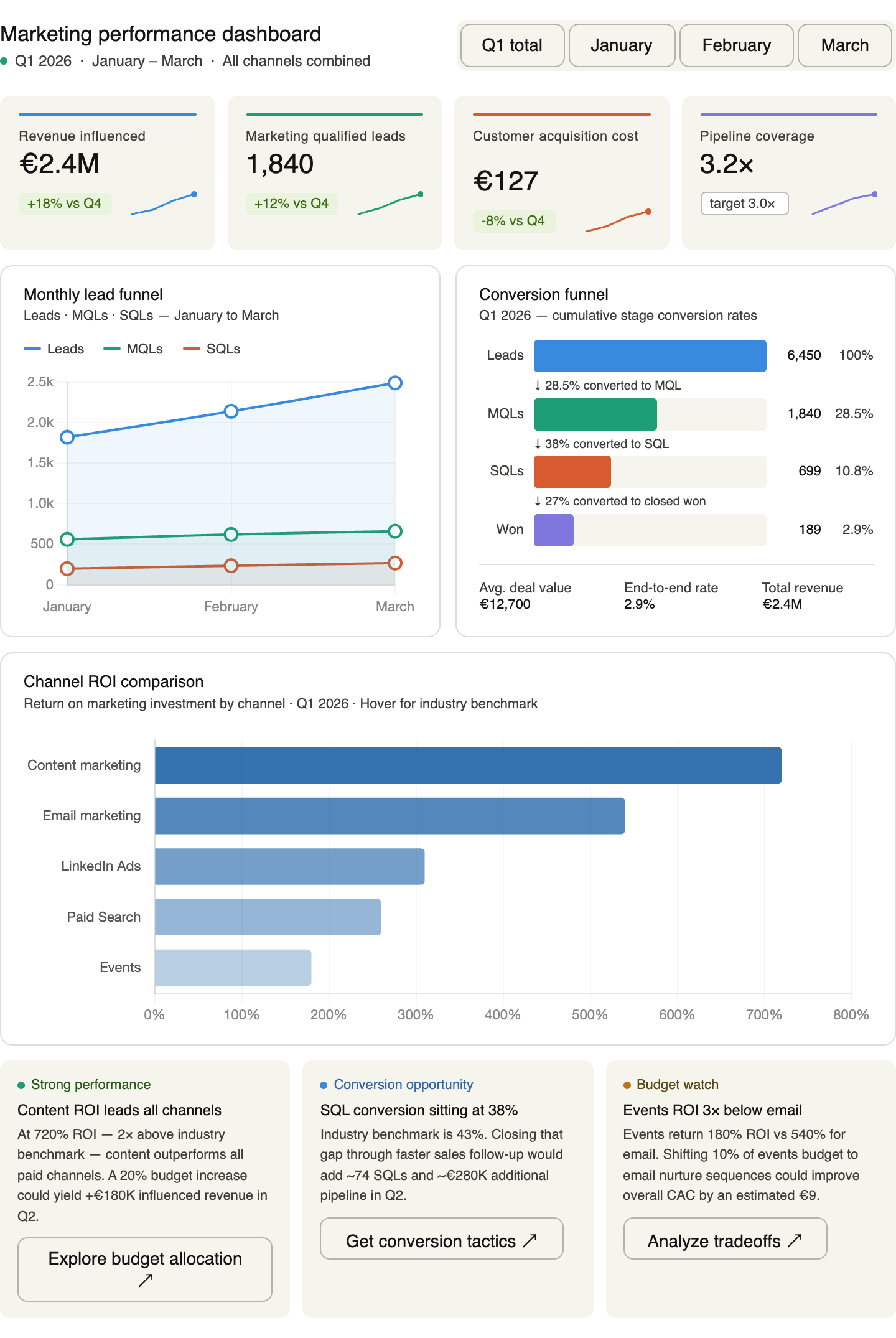
Be specific with your data. Vague prompts produce vague charts. The more concrete your numbers, labels, and dimensions, the better the output. Do not say “show me a funnel.” Say “show me a funnel with these five stages, these conversion rates, and these drop-off percentages.”
Always add context. Tell Claude who the chart is for and what decision it should support. A chart for your CEO looks different from a chart for your content team. Context shapes design.
Iterate in the same conversation. Your first chart will be 80% right. Stay in the session. Say “make the colors more distinct” or “add a trend line” or “change the X-axis to quarters.” Claude refines. You converge. That is how you work with an AI co-worker (and if you haven’t read my guide on that yet, start here).
👉 Premium subscribers unlock: How to share interactive charts with clients, stakeholders, and your team (public links, HTML exports, and presentation-ready formats). Plus all 10 ready-to-use marketing and sales use cases with copy-paste prompts: from performance dashboards and budget visualizations to funnel analysis, customer journey maps, competitive positioning, and marketing maturity assessments. Each with the exact prompt, a pro tip, and a live interactive example.